BRAND
A brand is not a logo. It is rhythm, voice,
atmosphere. It is the quiet language that speaks
before words. We shape identities that are clear yet
timeless, systems that breathe, evolve, and connect.
Minimal, but never empty. Precise, but full of life.
Mimant Studio crafts websites, visual identities, and User Interfaces with precision and minimalism. Each project is intentional, thoughtfully composed, and designed to feel alive — a subtle balance of art and function, where creativity meets clarity.





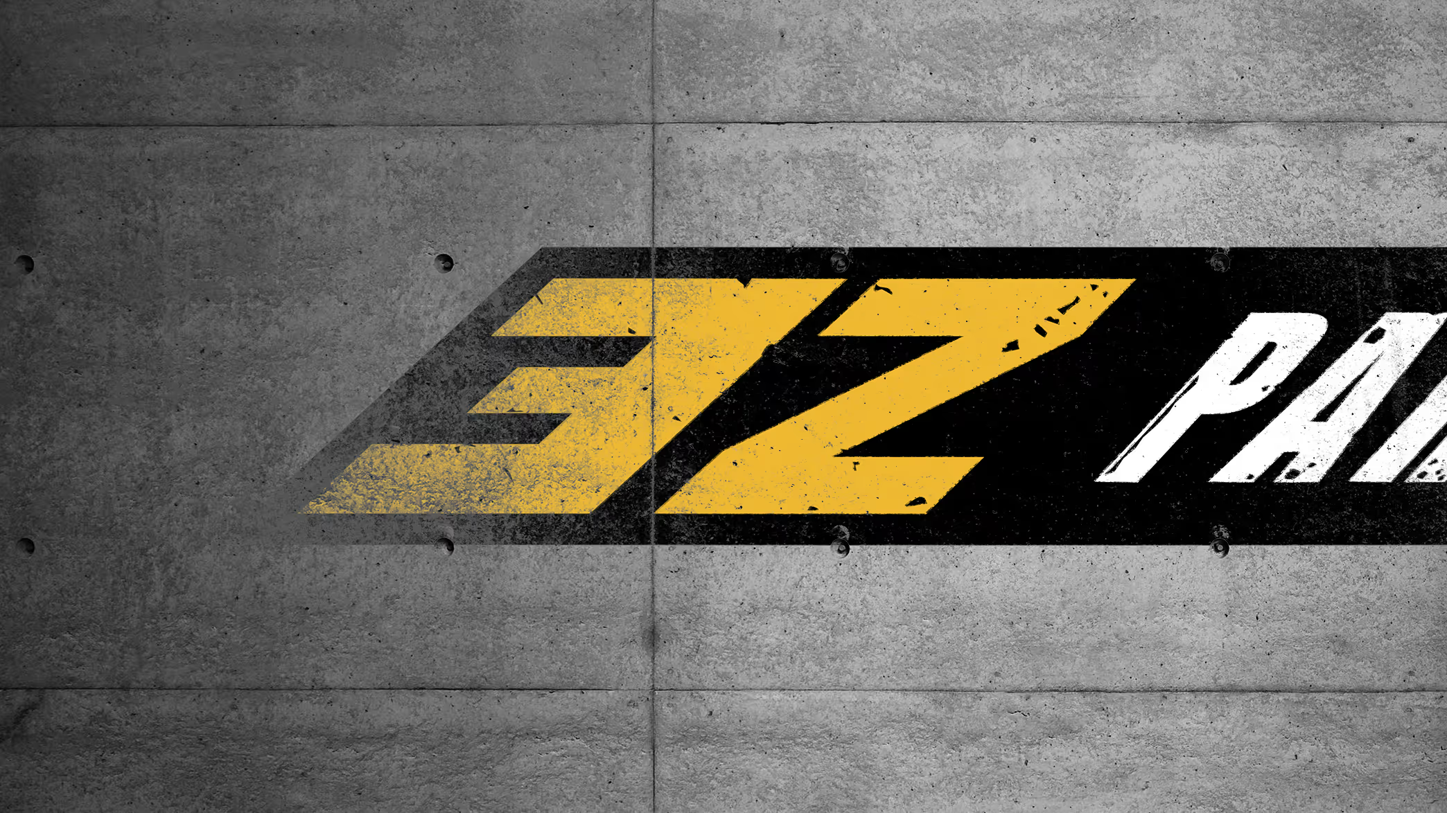
Speed. Precision. Control. 3Z Parts brings the language of performance into the digital space. The new branding reflects their bold, technical edge with clean geometry and sharp movement. Bold typography, sharp structure, and pure motion. Built to perform.

Innovation. Rhythm. Code. We shaped a brand that lives at the intersection of design and technology. Precise structure, fluid form, and an experience that connects idea to action. Web3 has never looked this effortless.


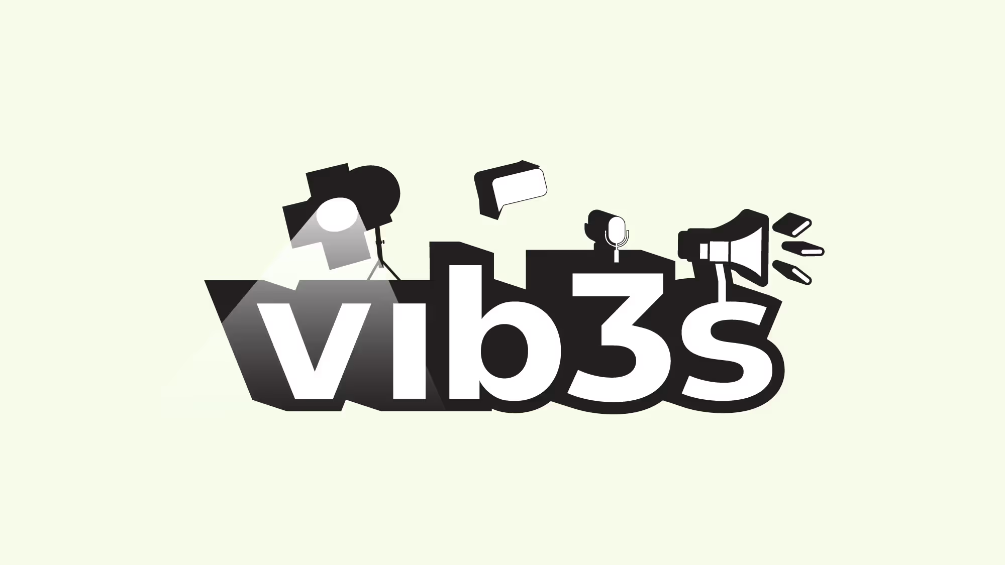
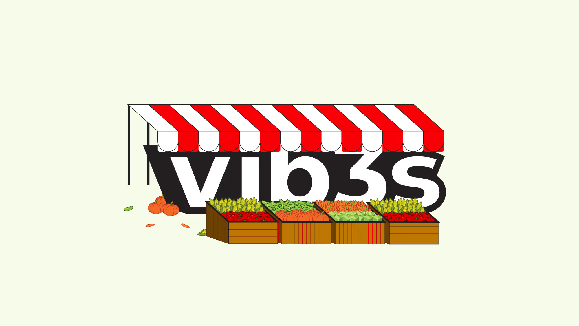
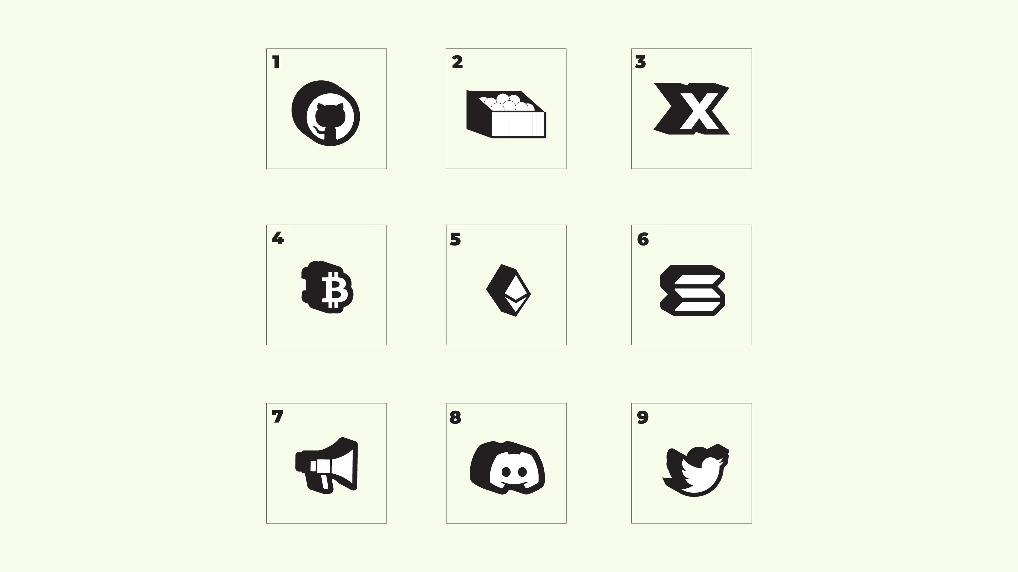
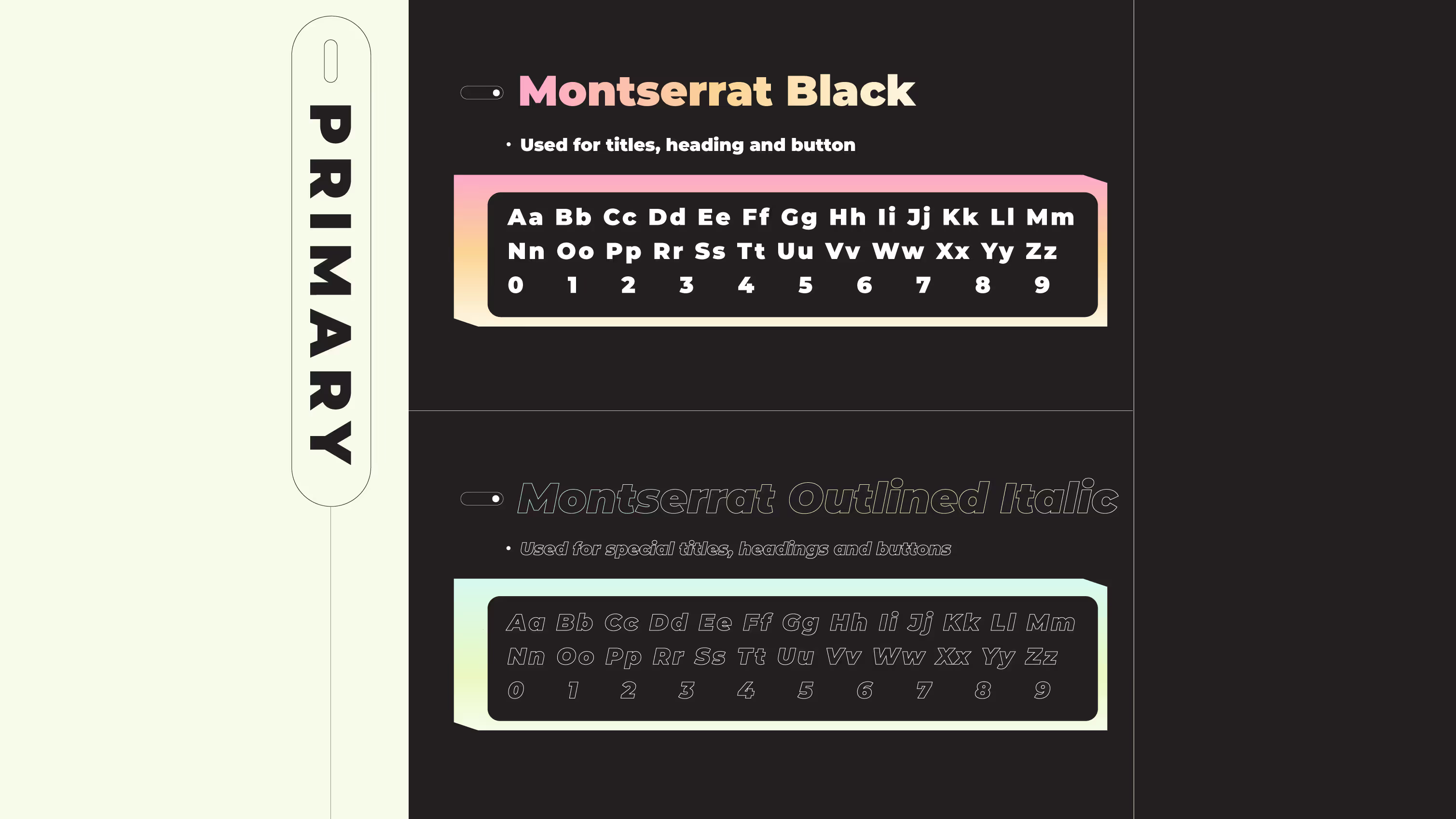
The brand identity was designed to convey the energy of community and digital creativity, clear, dynamic, and full of movement. Every detail, from typography to color, reflects the rhythm of the contemporary yet nostalgic spirit of new technologies. There’s a balance between past and future. Geometric shapes, pastel tones, and bold composition create a system that radiates energy, character, and confidence, just like the communities Vib3s brings together.

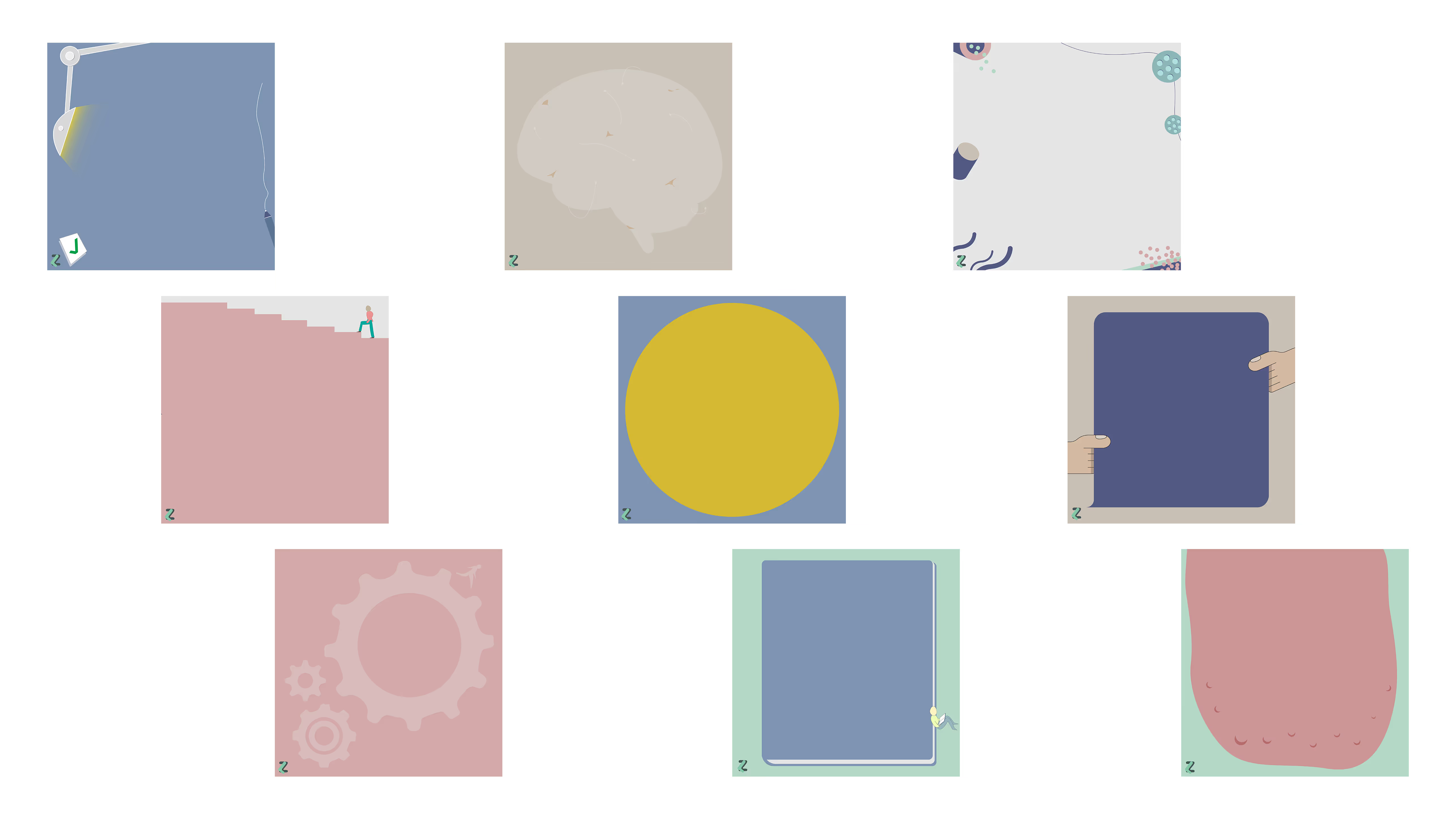
LogoZov is about finding your voice. We built a brand that feels supportive, calm, and full of warmth. Minimal design, open space, and gentle rhythm and a system that listens before it speaks.


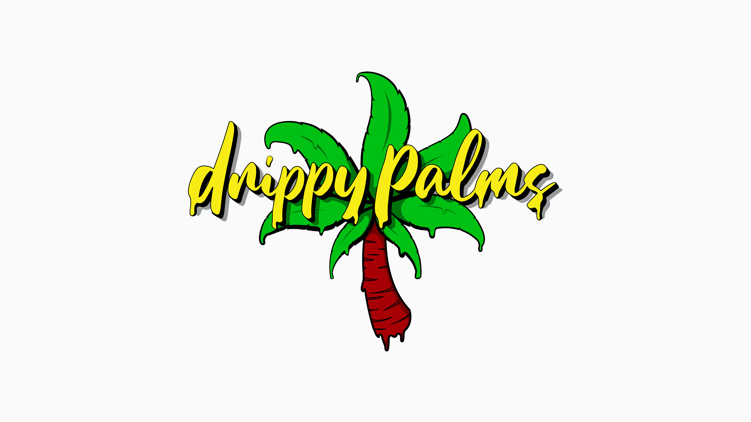
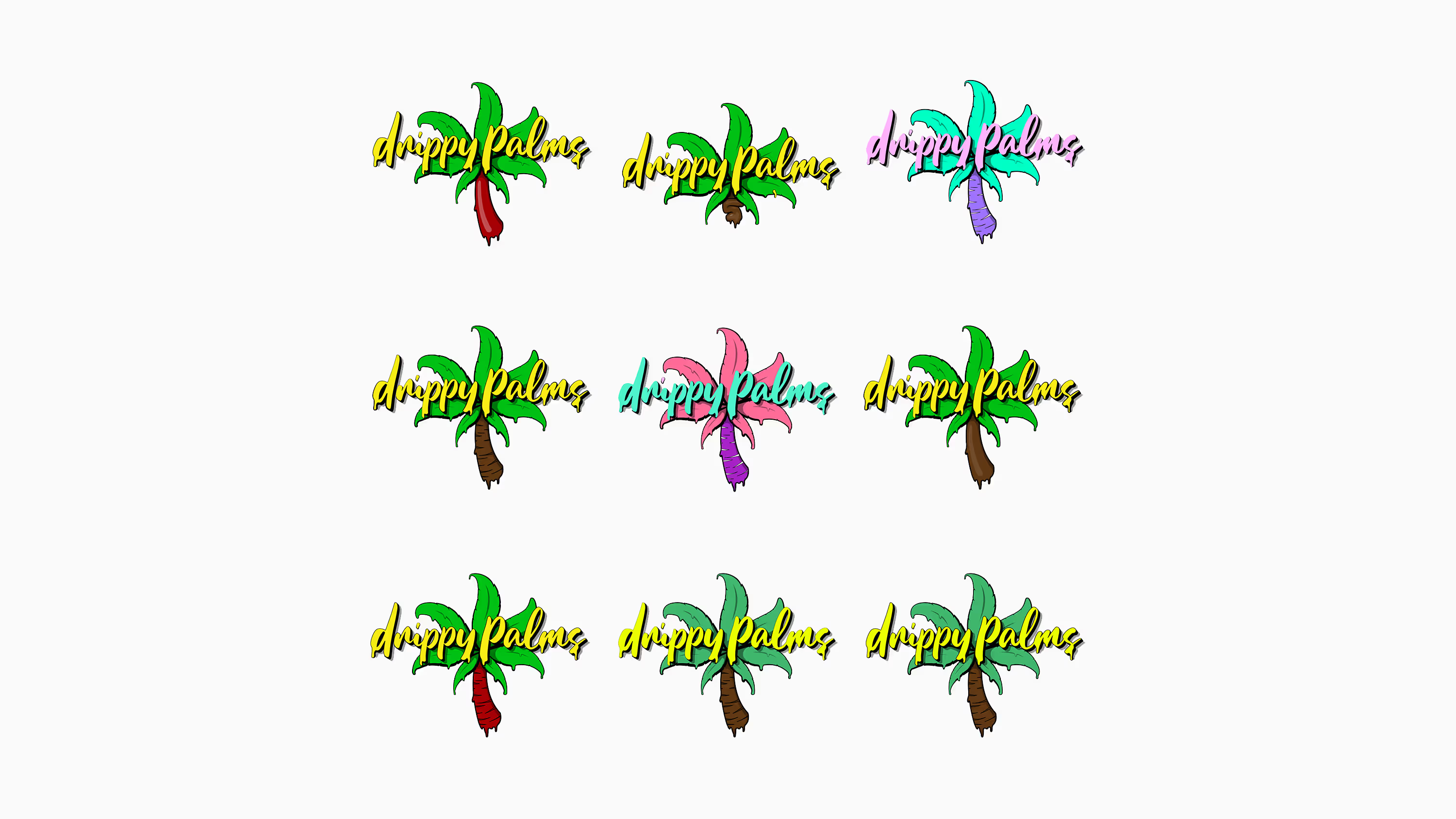
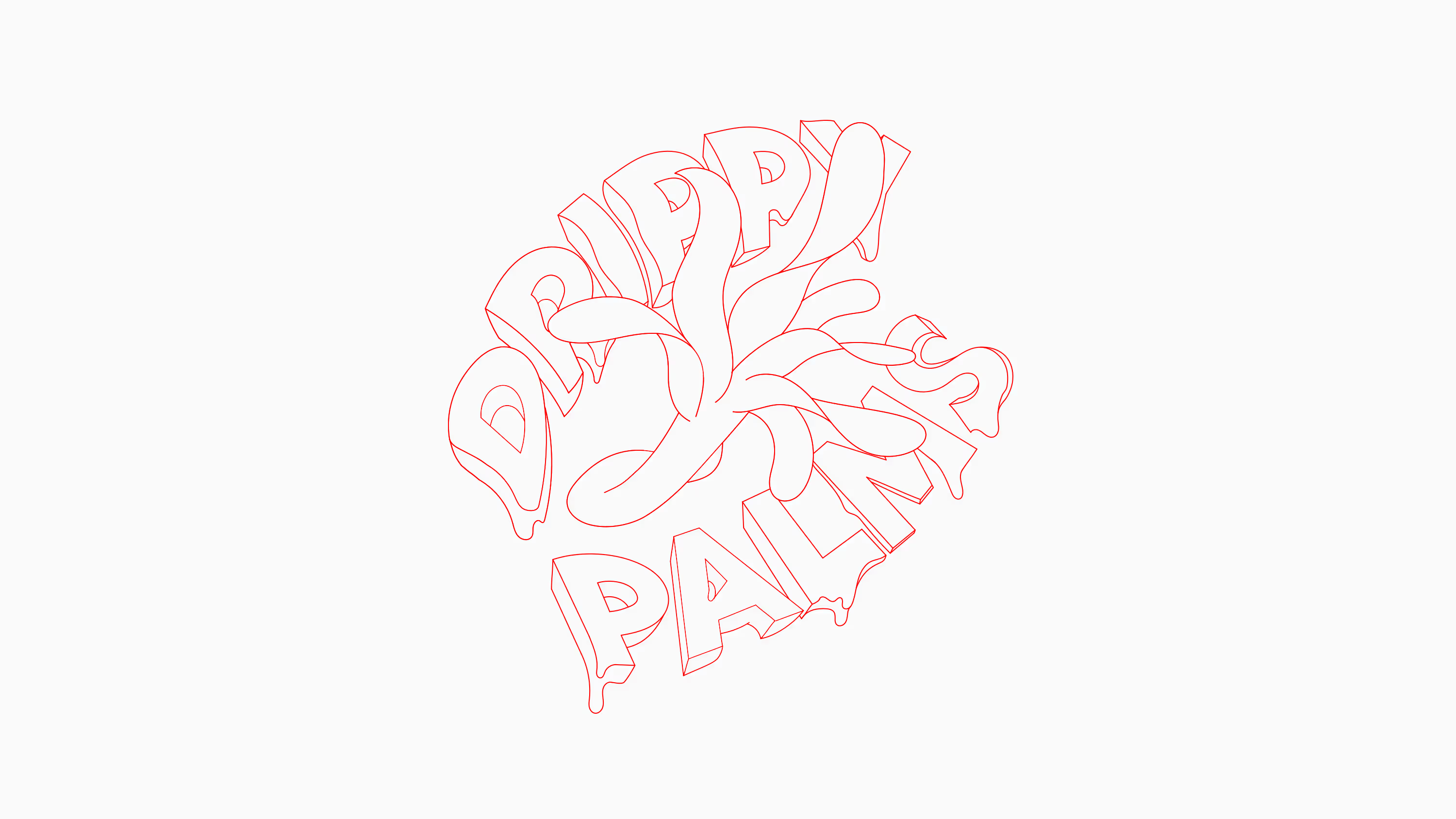
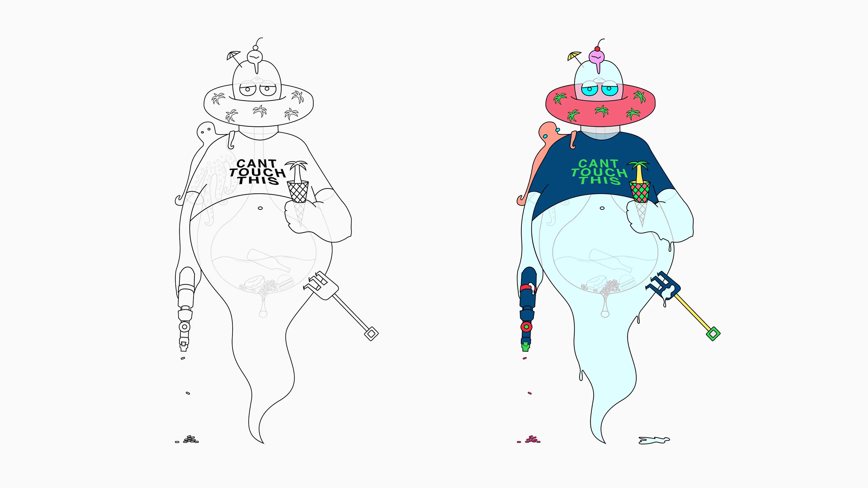
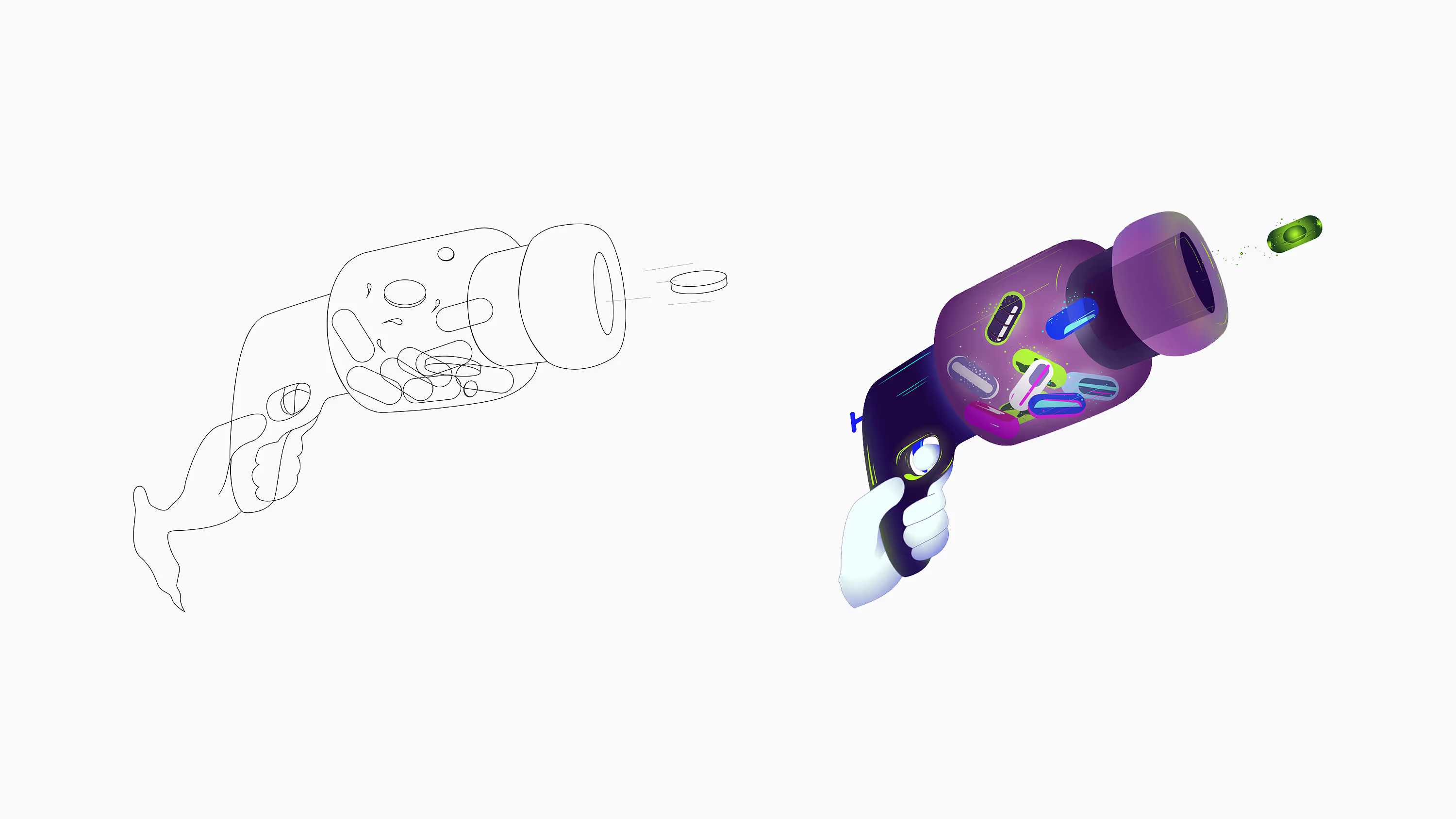
Drippy Palms was born as an idea for clothing and other essentials made for sunny days, created for those who prefer a laid-back style and living in the moment. The brand’s main goal is to express visual creativity through illustrations that reflect a positive vibe. The messages and artwork are made for hedonists living in warmer, sun-soaked coastal cities, those who enjoy every day under the palms.

AtoZ Ecommerce moves commerce forward. Clean visuals and precise messaging transform complex offerings into clarity, turning browsers into buyers. Every detail is built to guide, inform, and convert, modern, confident, and performance-driven. It’s a brand that doesn’t just exist online, it drives action, builds trust, and accelerates growth.


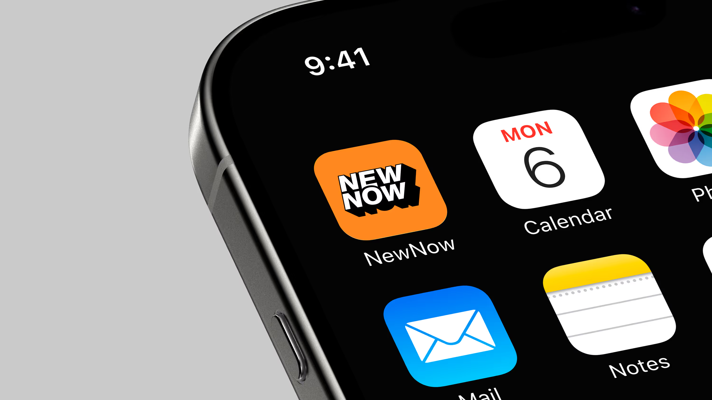
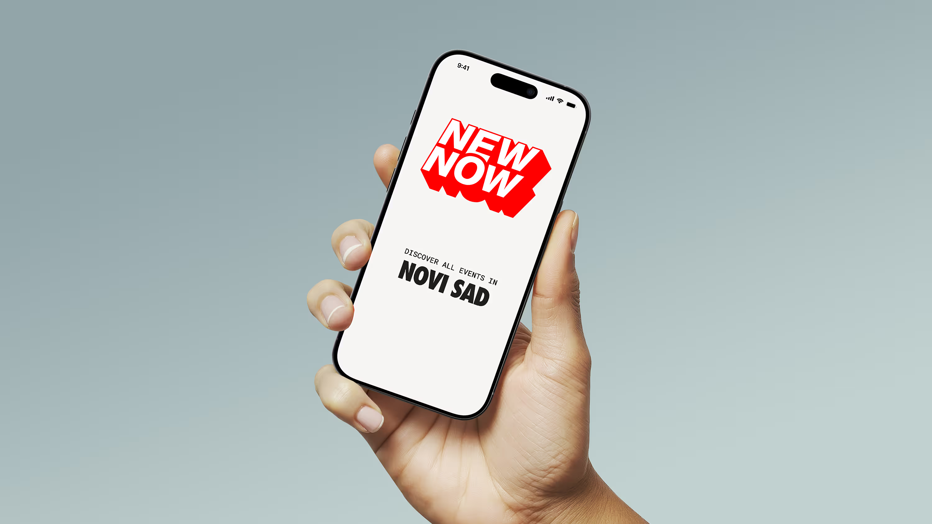
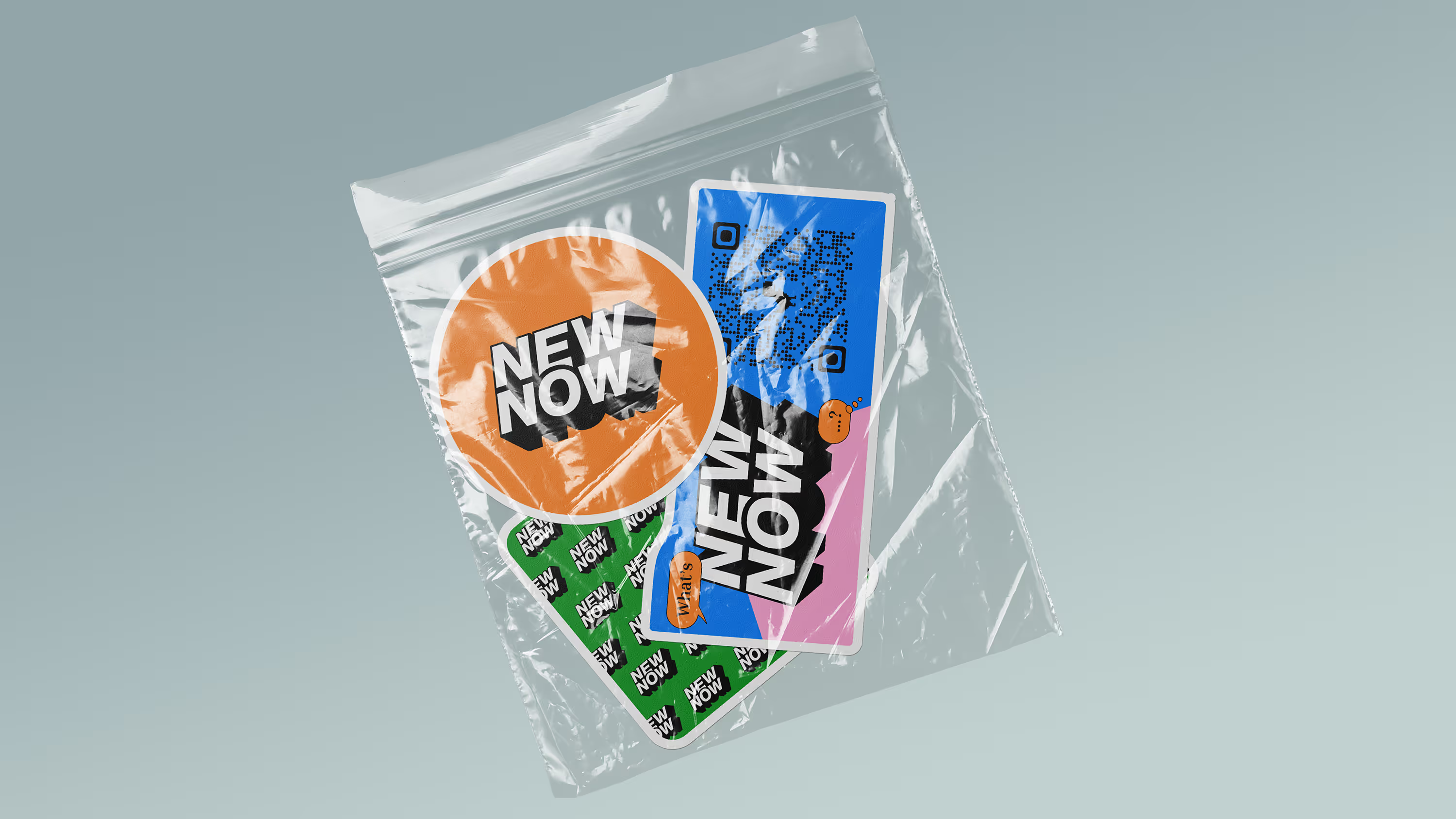
NewNow brings the city to your fingertips. Events, experiences, and happenings in Novi Sad are presented with clarity and flow, making discovery effortless. The interface feels alive, guiding users through the city’s rhythm with simple gestures, clean visuals, and intuitive navigation. A design that scales with ambition, ready to expand beyond borders while keeping every interaction meaningful

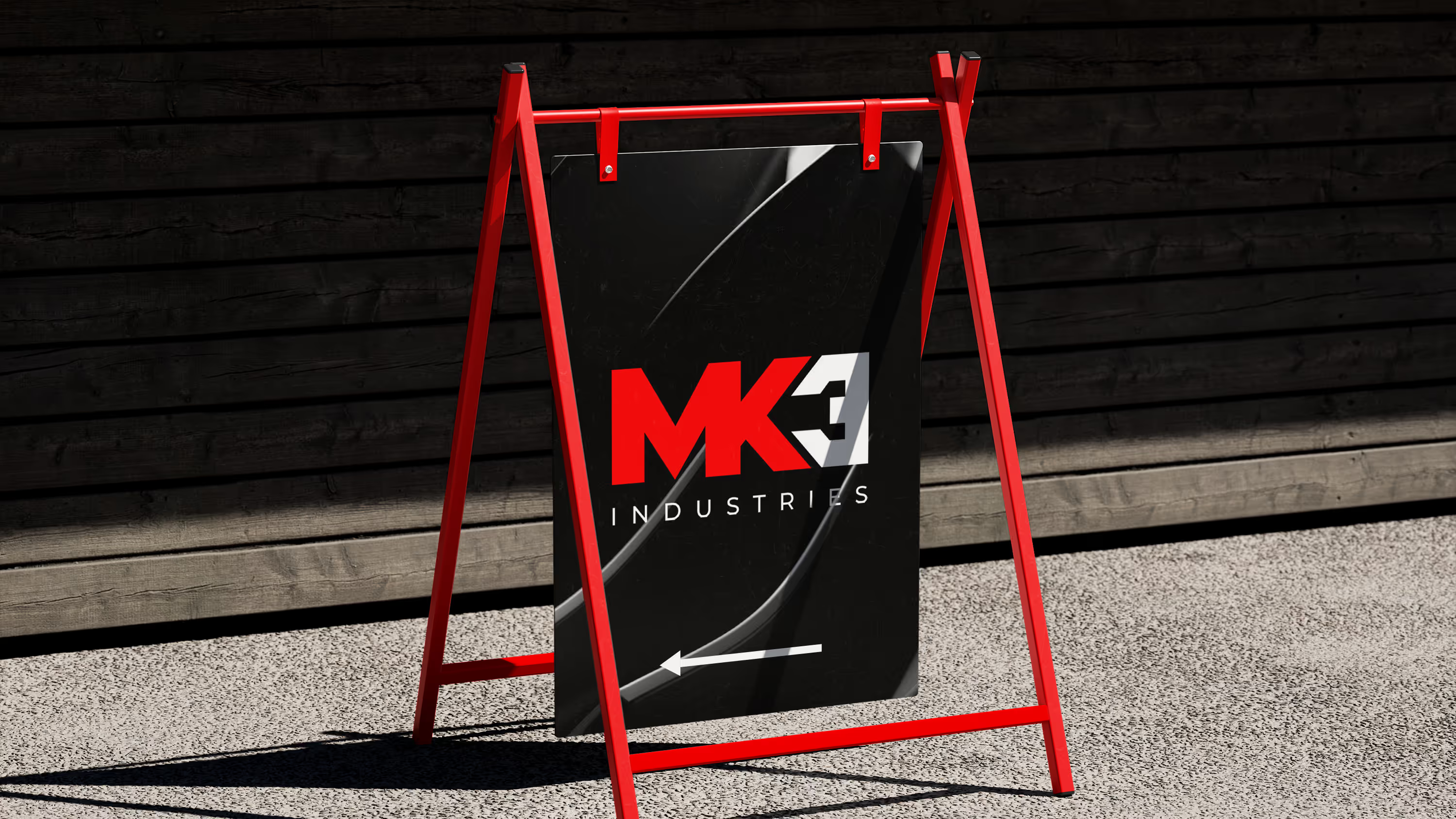
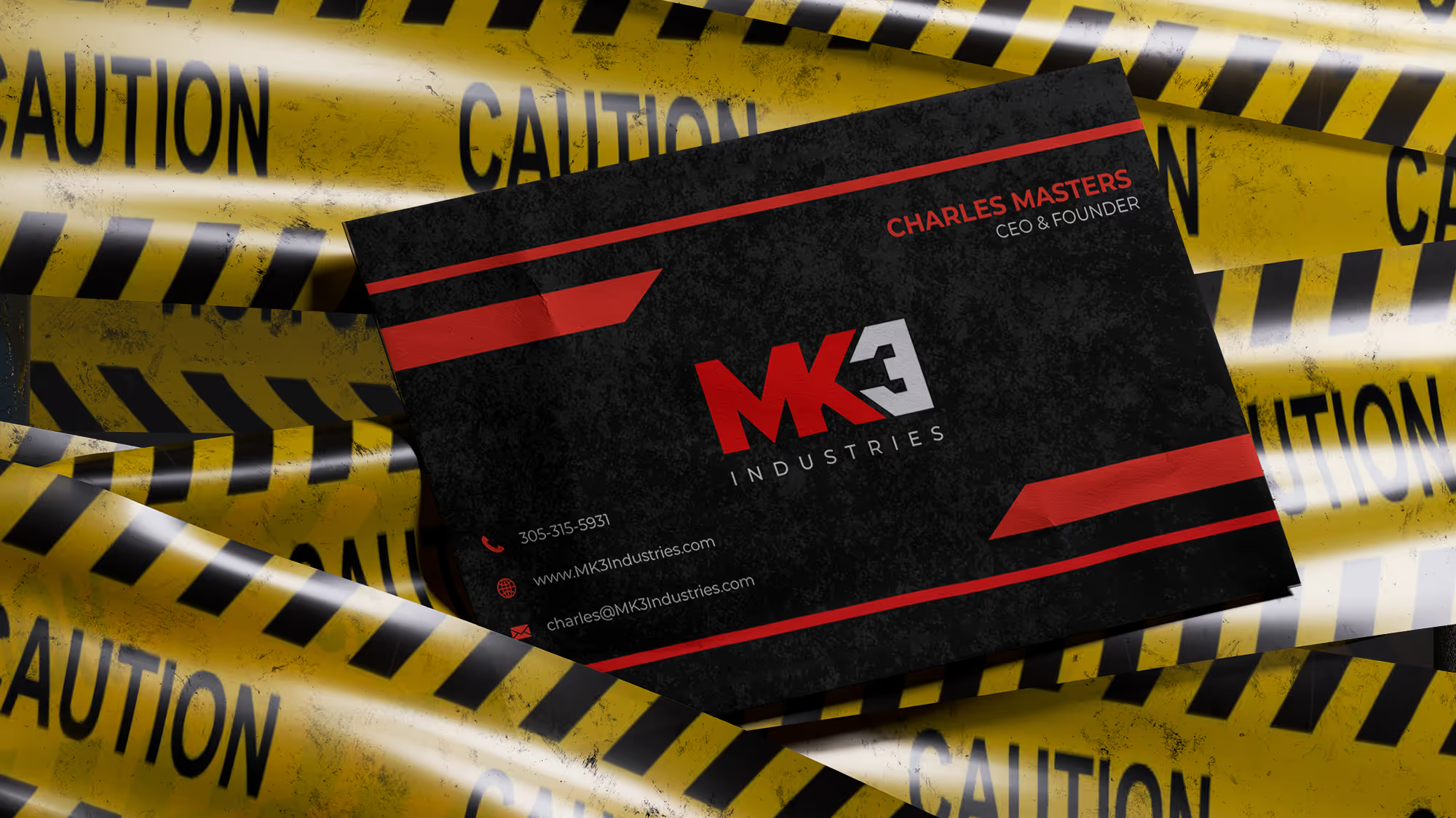
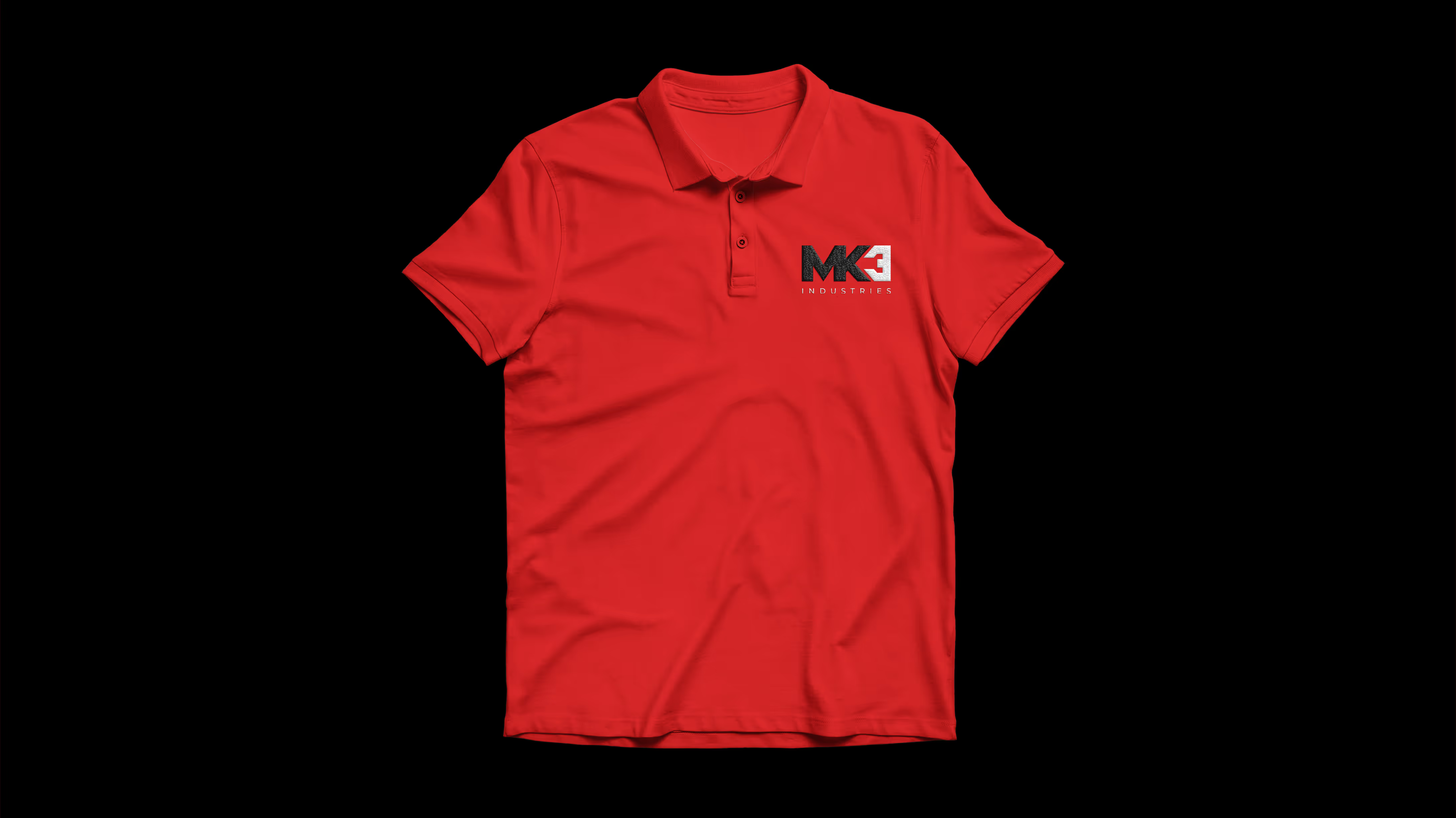
Strength, precision, and reliability define every aspect of MK3 Industries. The logo and visual identity reflect solidity and control, with clearly defined shapes that symbolize the power of their tools and professionalism. The result is a system that is simple yet striking, visually consistent and full of character, just like the products MK3 distributes.
A simple, clean, and functional design allows the brand to stand out in the technological space, while every visual element not only reflects expertise but also clearly communicates a vision for the future. Everything is designed to guide the user through a story of innovation, precision, and technological excellence. The result is a digital experience that is simultaneously elegant, intuitive, and authoritative, leaving a lasting impression of professionalism and technological mastery.

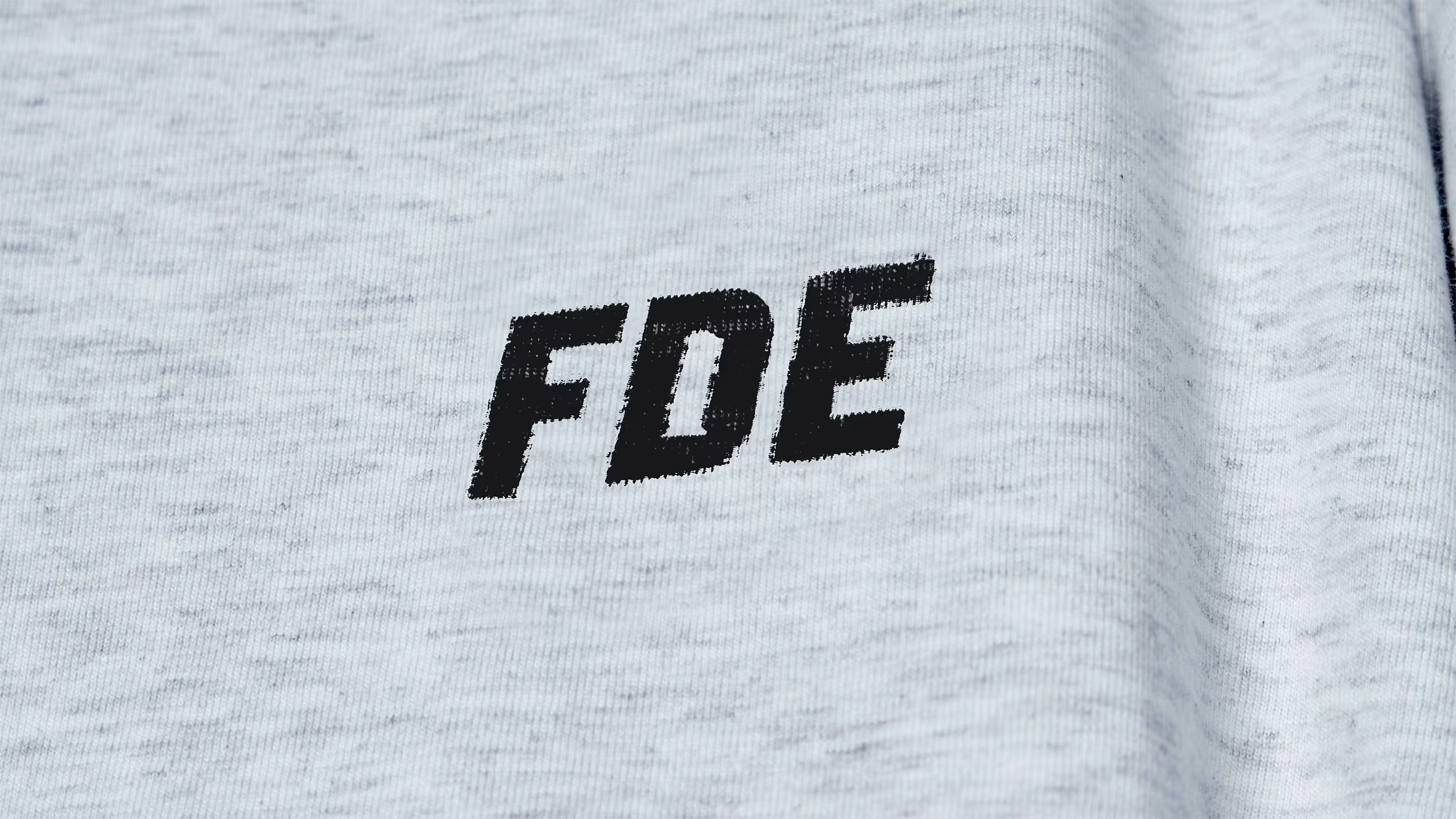
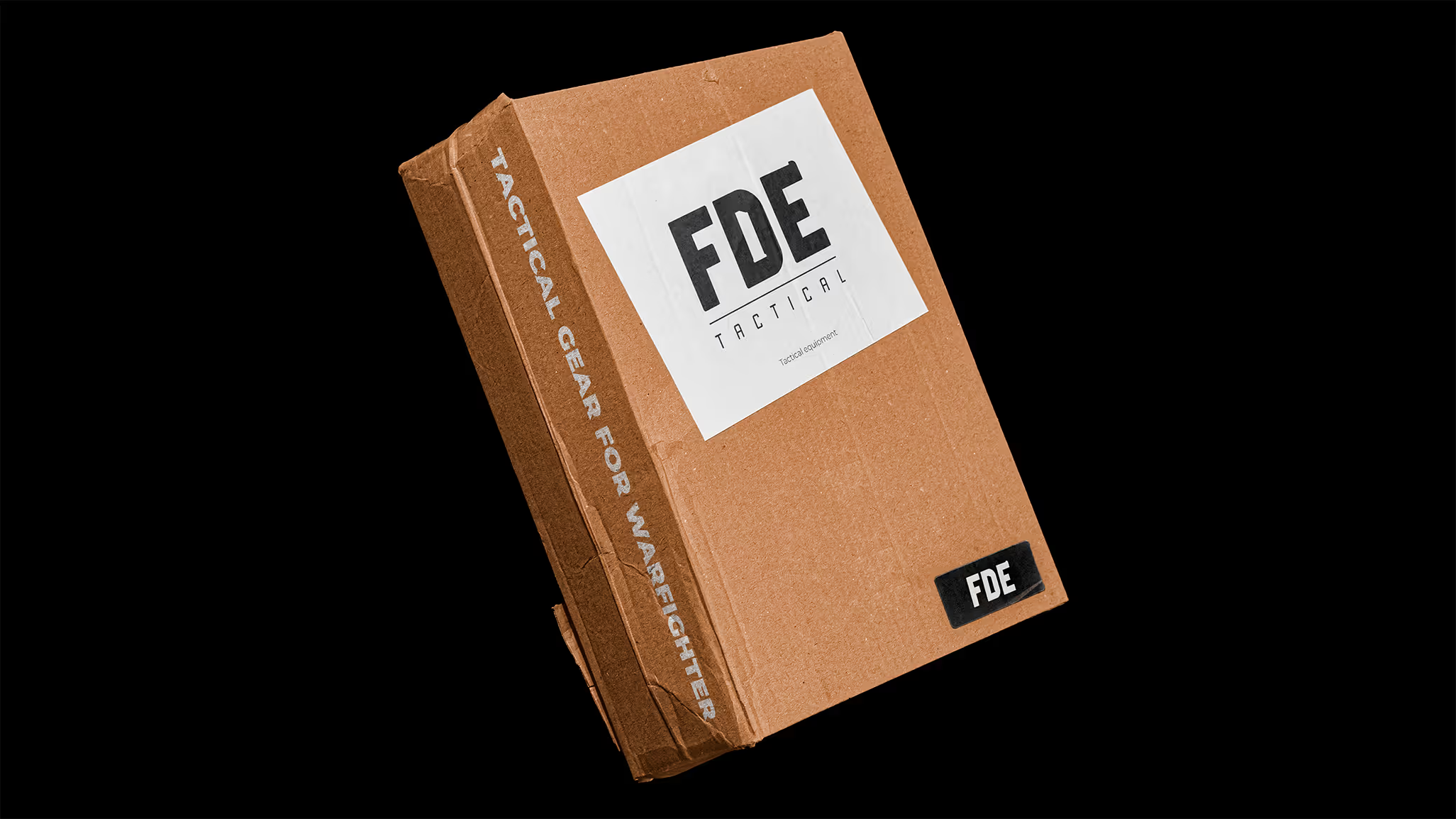
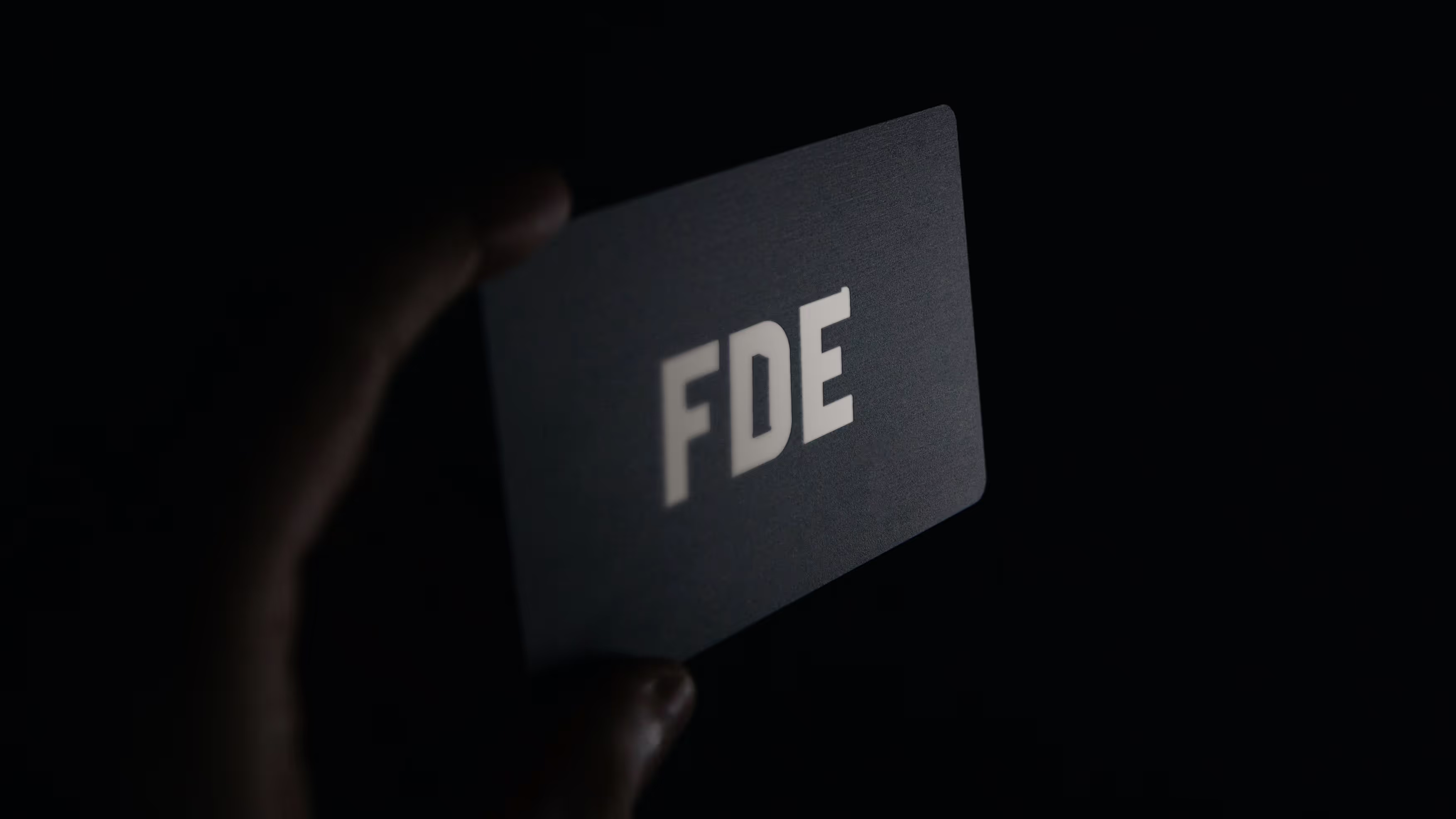
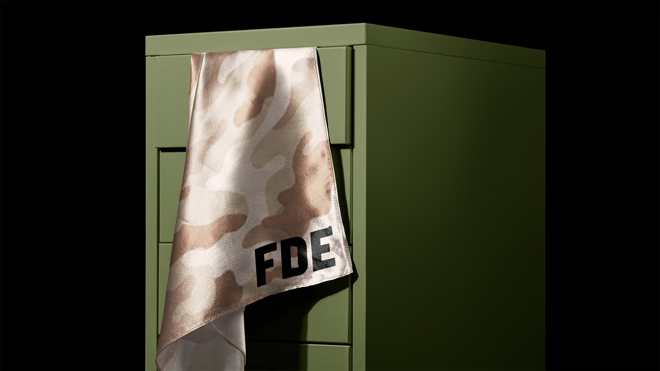
FDE Tactical stands at the intersection of utility and attitude. Gear, gadgets, and clothing move with the energy of the field, grounded in earthy army-inspired tones. Visuals are strong, structured, and unapologetically bold, creating a brand that feels ready for action.
A global network connecting the world by road, sea, and air. We created an identity that breathes simplicity and movement. Calm form, and a rhythm that follows the flow of global resources. Everything that is connected must first be understood.
